Effective Dashboards
When was the last time a production incident sent you to a service dashboard that only added to the confusion? Forty panels deep, every one of them bolted on during some past incident, none answering the questions flying around the incident channel. A director wants to know what the outage is costing. Support wants to know which customers are feeling it. The on-call engineer wants to know why the pods keep restarting.
I build service dashboards around those three questions, in that order, top to bottom. The top section shows what the service means to the business. The middle shows what users are experiencing. The bottom shows how the machines are holding up. Each section has its own audience, and the layout means each person can stop scrolling once their question is answered.
To keep things concrete, picture the payments service behind a retail shopping cart. It takes a cart, charges the card, and records the order. Every section below is built for that service, though the shape carries over to anything you run.
  flowchart TD
    B["<strong>Business impact</strong><br/><span class='mermaid-detail'>checkouts/min, payment success, revenue</span>"]
    U["<strong>User impact</strong><br/><span class='mermaid-detail'>latency, errors, traffic, saturation</span>"]
    H["<strong>Service health</strong><br/><span class='mermaid-detail'>CPU, memory, restarts, logs</span>"]

    B -->|"explained by"| U
    U -->|"explained by"| H
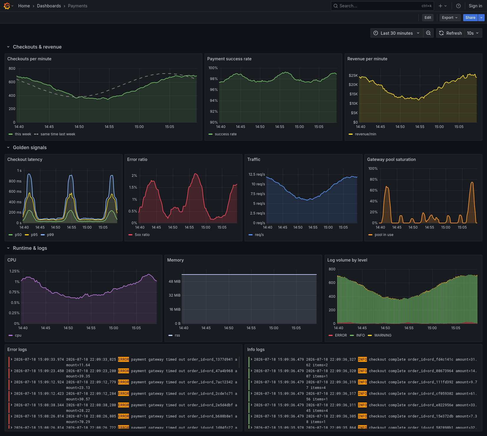
Here’s the whole thing built in Grafana for the payments service:
Business impact
The top of the dashboard should say what the service is worth. For the payments service that’s successful checkouts per minute and the revenue moving through them. Payment success rate belongs up here too, because a run of declined cards is a business problem before it’s an engineering one. A search service would show something else, maybe the fraction of searches that end in an add to cart, but the rule is the same: the first row shows the service doing its job in units the business already uses. Checkouts and dollars rather than requests and milliseconds.
The panels up here need a baseline, because an absolute number means very little on its own. Is 240 checkouts a minute good? Depends entirely on whether last Tuesday at this hour did 250 or 400. Plotting the same series offset by a week turns every panel into a comparison:
sum(rate(checkouts_completed_total[5m])) * 60
sum(rate(checkouts_completed_total[5m] offset 1w)) * 60

When the current line dips below the dotted one from last week, severity stops being a matter of opinion, and this row becomes the screenshot in the incident channel. It also works in the other direction: a scary-looking latency spike that never touches this row is a calmer conversation, and you can often skip paging half the org over it.
User impact
The middle section answers what users are feeling, and the four golden signals cover it well: latency, traffic, errors, and saturation.

For latency, plot percentiles rather than averages. An average hides the slow tail where the pain lives, since the payments service can hold a 40ms mean while every hundredth shopper watches a spinner after tapping pay. I keep p50, p95, and p99 on the same panel so the tail is visible next to the typical case:
histogram_quantile(0.99,
  sum by (le) (rate(http_request_duration_seconds_bucket[5m])))
Errors belong here as a ratio rather than a raw count, and each one is a shopper looking at a failed payment screen. Five hundred errors a minute sounds alarming until you notice traffic doubled and the failure rate is the same 0.1% it always was:
sum(rate(http_requests_total{code=~"5.."}[5m]))
  / sum(rate(http_requests_total[5m]))
Traffic itself earns a panel because the other three signals only make sense against it. A latency spike during a flash sale and a latency spike at 4am on a Sunday are different problems.
Saturation is the quiet one, and the one I check first. Queue depth and the connection pool to the payment gateway move before latency does. When the pool panel has been climbing for twenty minutes, the p99 spike that follows isn’t a surprise, and sometimes you get to fix things before the two sections above ever notice. The screenshot above shows the pairing, with each latency hump sitting on top of a pool spike.
Service health
The bottom section is for the engineer who has to figure out why. CPU and memory per pod, restart counts, GC pauses if the runtime has them, disk if the service touches one. This is where causes live, and it deserves the same care as the rows above it even though nobody outside the team will ever scroll down this far.
Logs earn two panels here. The first is log volume by level, because a jump in error-level logs often beats the error ratio panel to the punch, and a sudden silence in info logs is its own kind of alarm. The second is a live tail of recent errors, which saves the reflex of shelling into a pod. It’s also usually where a misbehaving payment gateway first shows its name.

One habit worth breaking: this section almost never deserves to page anyone on its own. CPU at 85% with a flat user section is trivia. The bottom row exists to explain the rows above it, so let its alerts file tickets and let the user section wake people up.
Reading top to bottom
The layout puts effect above cause on purpose. During an incident you read downward: the business section tells you how bad it is, the user section tells you who’s hurting, and the engineering section tells you why. Outside an incident the same dashboard reads upward. When someone proposes doubling the fleet because CPU looks high, scrolling up to a flat latency panel and an untouched checkouts panel settles that conversation quickly.
The discipline that keeps it working is refusing the junk drawer. Each section gets four to six panels, and every panel has to answer a question someone actually asks during an incident. The one-off panel that helped debug last month’s weirdness goes on a separate debug dashboard where it can sprawl. The next time the director, support, and the on-call engineer all ask at once, the main dashboard answers each of them in order.